
Konig
My preference for abstraction was a personal bias.
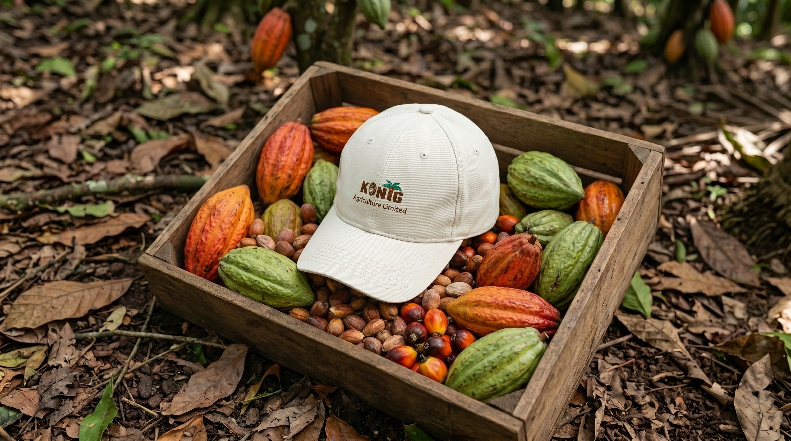
I began the project believing the strongest logos were simple and abstract. However, the stakeholders did not buy into minimalism or abstraction,They wanted a mark that immediately reflected cocoa and plantation agriculture. After five iterations, we arrived at a combination mark featuring custom typography with cocoa and palm tree illustrations.
After the logo has been approved, I realized my preference for abstraction was not a universal design principle. It was a personal bias. For the audience of the Product, familiar symbolism created clarity, trust, and connection.
This insight shaped the identity, I expanded the logo with a verbal identity, colour and typography, a pattern derived from the cocoa pod, and applications across stationery, packaging, outdoor advertising, and brand communications.
Konig taught me that successful branding isn't about choosing abstraction over symbolism or vice versa. It's about choosing what best serves the audience.
Konig
Case Story
Konig
My preference for abstraction was a personal bias.
I began the project believing the strongest logos were simple and abstract. However, the stakeholders did not buy into minimalism or abstraction,They wanted a mark that immediately reflected cocoa and plantation agriculture. After five iterations, we arrived at a combination mark featuring custom typography with cocoa and palm tree illustrations.
After the logo has been approved, I realized my preference for abstraction was not a universal design principle. It was a personal bias. For the audience of the Product, familiar symbolism created clarity, trust, and connection.
This insight shaped the identity, I expanded the logo with a verbal identity, colour and typography, a pattern derived from the cocoa pod, and applications across stationery, packaging, outdoor advertising, and brand communications.
Konig taught me that successful branding isn't about choosing abstraction over symbolism or vice versa. It's about choosing what best serves the audience.
Konig
Case Story
Konig
My preference for abstraction was a personal bias.
I began the project believing the strongest logos were simple and abstract. However, the stakeholders did not buy into minimalism or abstraction,They wanted a mark that immediately reflected cocoa and plantation agriculture. After five iterations, we arrived at a combination mark featuring custom typography with cocoa and palm tree illustrations.
After the logo has been approved, I realized my preference for abstraction was not a universal design principle. It was a personal bias. For the audience of the Product, familiar symbolism created clarity, trust, and connection.
This insight shaped the identity, I expanded the logo with a verbal identity, colour and typography, a pattern derived from the cocoa pod, and applications across stationery, packaging, outdoor advertising, and brand communications.
Konig taught me that successful branding isn't about choosing abstraction over symbolism or vice versa. It's about choosing what best serves the audience.
Konig
Case Story